If you publish your WordPress blog and just wait for visitors to flock to your site, you’re likely to be disappointed. There are millions of blogs with new ones starting every day, and unless you do something to make yours stand out, it will get lost in the crowd.
That something you need is called branding. With a small business, branding is the creation of a consistent, positive image concerning the company and its products or services. With a business blog, branding is using the visual elements to create a consistent yet distinct look and feel for the website. It attracts positive attention, encourages visitors to stay and look around and makes them want to come back. Branding is the cornerstone of your website’s reputation.

Inspiration for Memorable Branding Elements
Branding is an attribute of the WordPress blog as a whole, but it’s made up of separate elements. These elements have to be strong on their own and also work together. It’s easy to get stuck creating the individual elements, for example, deciding on a domain name or choosing which colors to use. Here are seven elements you need to consider and some ways of finding inspiration to make each element effective and distinctive.
1. Name

Like the name on a physical storefront, your name should capture the imagination and accurately reflect what visitors will find inside. It needs relevant keywords to show up on search engine pages. It should inspire browsers to think, “Hey, I’m interested in that!” It should be clear, concise and easy to read and pronounce.
To help you think of a name, you can use a keyword search tool such as Google Keyword Planner or KWFinder to find relevant words and phrases to include. Look for keywords that have high search volume but not too much competition. You might experiment with these, inserting them in phrases and sentences.
Another possibility is to use an online domain name generator. When you enter a few keywords, it comes back with domain name suggestions.
2. Logo

Many bloggers don’t use a logo, but they should. First, it establishes your site as a credible one run by an authority. In addition, it catches the eye and makes visitors take a closer look. And it becomes associated with your blog in the mind of the viewers, making them more likely to return.
There are lots of stunning logo designs already in circulation, plus plenty more just waiting to be created. There’s no reason yours shouldn’t be the next one. Browse through some of the best existing logos from related industries and see which captures your fancy.
You can also try one of the online logo makers. You enter your name, something about your topic and some design preferences, and they give you sample logos to consider. You can even modify them to your liking. There are many you can try for free.
3. Color Palette
When visitors land at your website, one of the first things they notice is color. A consistent, attractive color scheme draws them in, and nondescript or garish colors can drive them away.
Start by considering the psychology of color and which colors reflect the values you embrace. For example, red indicates passion and energy, blue denotes competence and trustworthiness, green is associated with nature and sustainability, yellow implies friendliness and black represents formality and sophistication.
Decide which color or colors best represent your message. Look at websites that use those colors. Notice if they employ different shades of a color or whether they favor complementary and contrasting colors. Don’t forget that white is a color, too, and consider how they use whitespace.
Take some crayons or colored pencils and experiment on paper, or evaluate color combinations with drawing software.
4. Font/Typography

When you write a Word document, you probably pick a font without giving it much thought. On your blog, however, the on-screen appearance of the words is almost as important as what they say.
As with colors, different fonts and styles convey different messages. For example, block fonts denote strength and stability, elaborate fonts tend to be formal and unusual fonts suggest playfulness. Think about which font conveys the image you want.
When you’re looking at fonts, don’t limit your search to the online world. Typography is everywhere: on posters, on building signs, in magazines, and on fliers. Accustom your eyes to noticing it.
You’re probably going to use two or three fonts for different purposes on your blog. Pair some with your colors to see how they look together.
5. Tagline/Slogan

Just do it. You’re in good hands. What’s in your wallet?
When we hear these, we immediately think of the brand they represent. How powerful would it be if your blog had a tagline or slogan that stuck in people’s minds the way these do? Your slogan may never be as universal, but it can become recognized by your target audience.
One way to capture the right phrase is with freewriting. Open a word document, set a timer for 10 minutes and start pounding the keyboard. Put down whatever words come to mind, and don’t stop to correct typos. You may look back when you finish and find your slogan staring out at you.
Other suggestions: take the keywords that pertain to your topic, and write 10-15 slogans using each. Or use an online slogan generator.
6. Tone
Tone is harder to define because it isn’t a specific identifiable element. It’s the overall voice of your WordPress blog. Tone can be friendly, authoritative, curious or formal.
Your tone not only needs to be appropriate for your topic. It has to be natural for you as a person. Users are drawn to a tone that’s authentic.
One way to discover your ideal tone is to describe your website out loud. Talk to a friend or even talk to yourself. Maybe record it. Expound on why you started the blog and what you hope to accomplish. Possibly talk through what one of your first posts will discuss.
Once you’ve identified your tone, attune your mind to it every time you update your blog.
7. Images
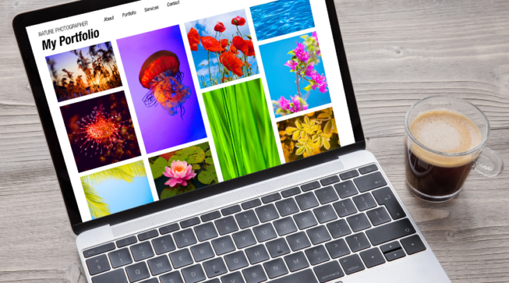
Your blog is likely to have plenty of images, from page backgrounds to photo galleries. You can use photographs or drawings. However, your site will have a few key images that will be the first ones visitors see. If you choose these well, other images will fall in line with them.
As with colors and fonts, think about what you want to convey. List the adjectives you’d like people to use to describe your site. These could be fun, exploratory, serene, instructive or authoritative. Choose images that reflect these qualities, whether they’re people smiling, people working together, nature scenes or people using a product or technique.
Always have an eye out for pictures or actual scenes in the physical world that express what you want to say.
Elements That Work Together To Build a Brand
There are a number of practical techniques to inspire you in developing specific elements for your blog. However, it’s important to cling to a consistent vision of your blog’s purpose throughout the process. That will ensure consistency across your elements so that they all adhere to the same philosophy.
All elements should tie to the theme of your WordPress blog. They should all aim for the reaction that you want from visitors. They should be memorable in order to draw users back, and they should imply fun, innovation, authority or adventure, depending on your topic and the personality you mean to project.


GIPHY App Key not set. Please check settings